-
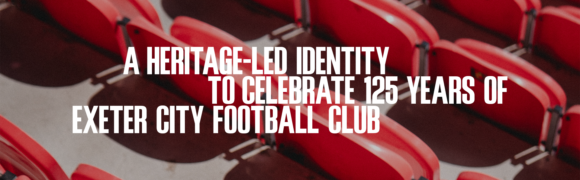
ABOUT THE PROJECT
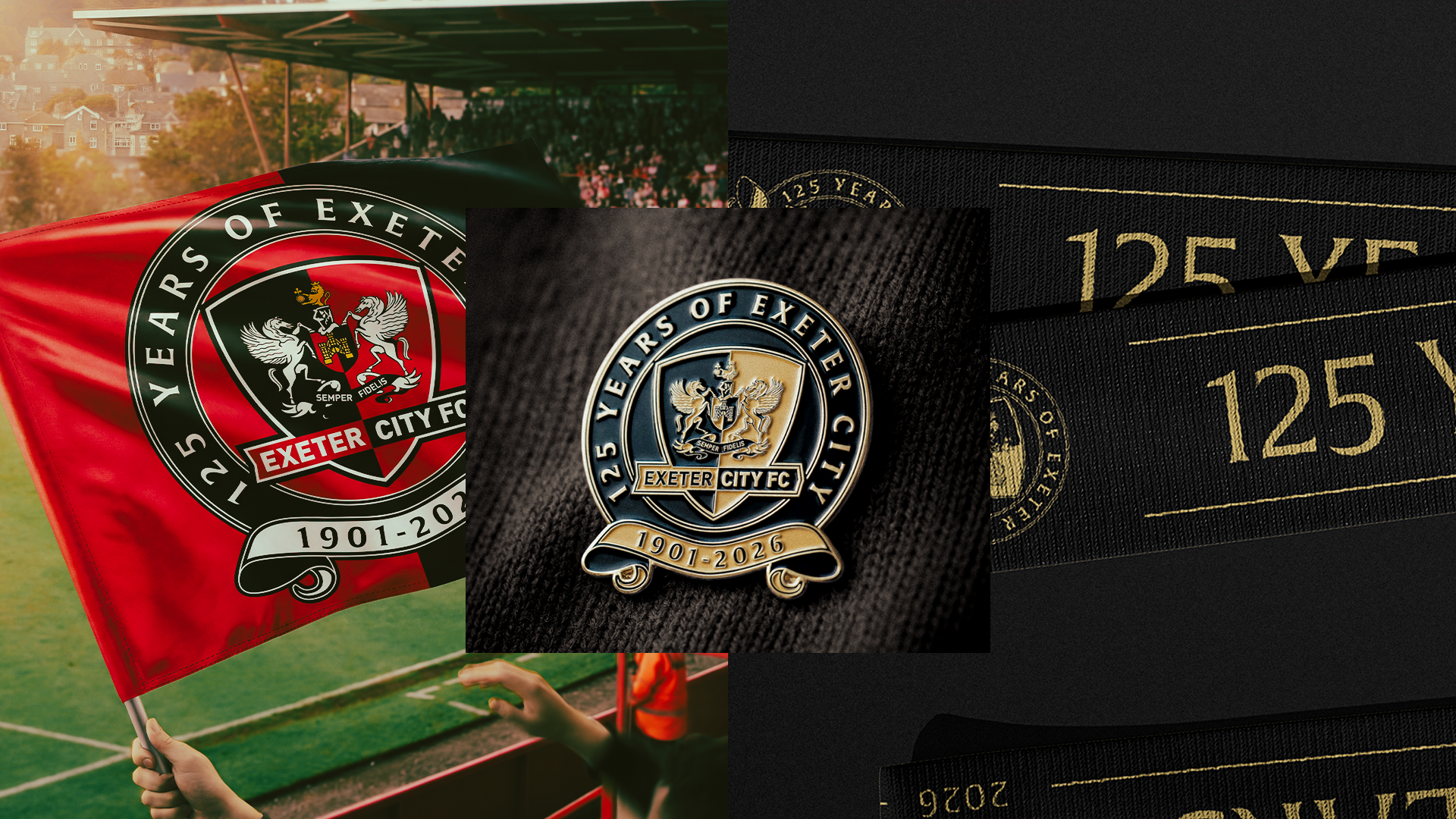
The project originated from a brief to produce a gold adaptation of Exeter City’s existing crest. While this would have provided a simple visual distinction, it quickly became apparent to me that a milestone of this significance presented an opportunity to create something with greater meaning and longevity. Rather than treating the anniversary as a decorative variation of the current identity, the project evolved into the creation of a dedicated commemorative mark designed to reflect the importance of the club’s 125-year history.
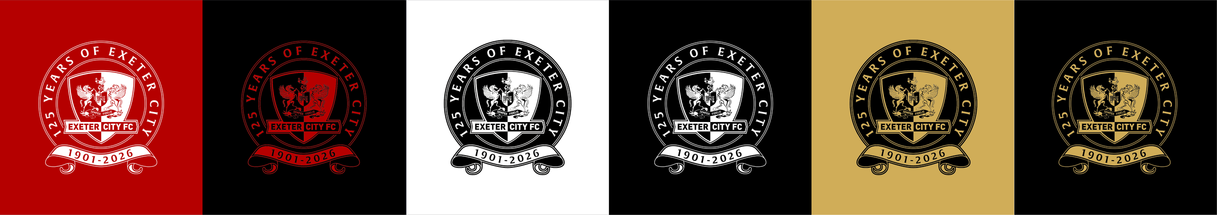
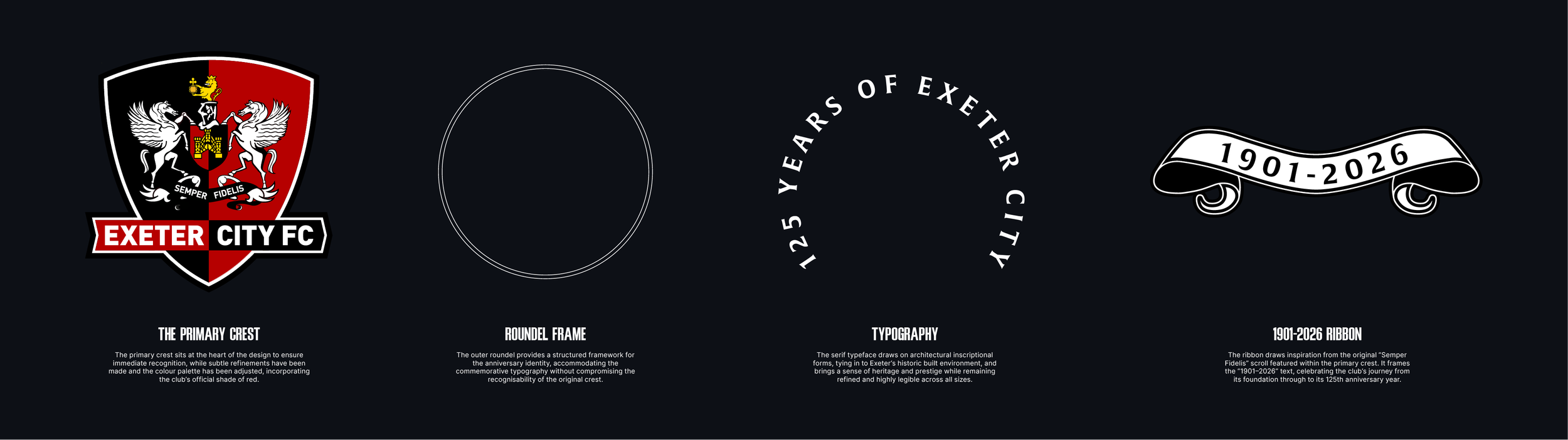
It was important that the identity felt special and celebratory while remaining unmistakably Exeter City. Every element was therefore informed by the club’s existing visual identity, ensuring the final mark felt like a natural evolution of the crest rather than a departure from it. The outcome is an anniversary identity that respects the club’s heritage while providing a stronger sense of occasion for a landmark year.
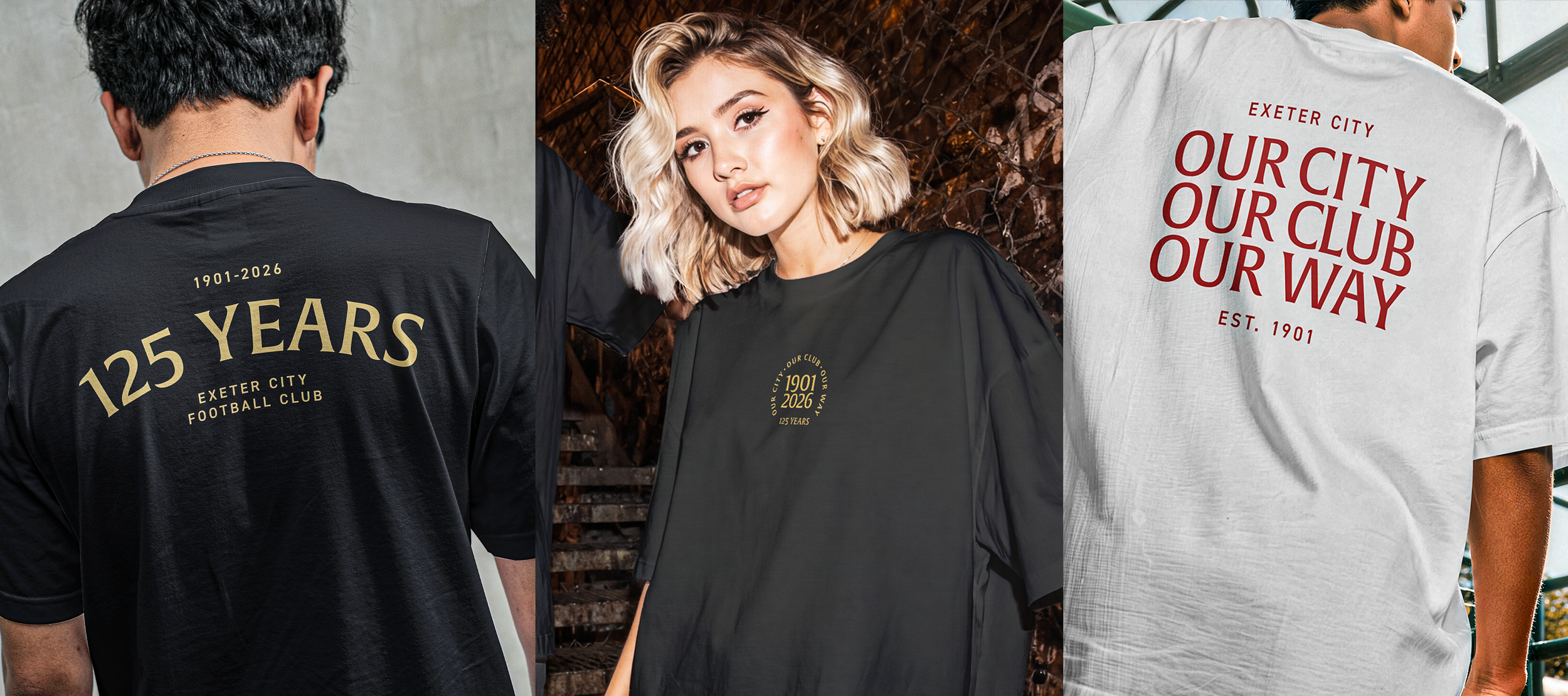
Beyond the crest itself, the project expanded into a wider visual system designed to work consistently across a season-long programme of communications, merchandise, stadium signage, matchday assets and digital touchpoints. This shift transformed the work from a simple crest adaptation into a broader anniversary identity, providing the club with a more considered and flexible framework through which to celebrate its 125th year.
-
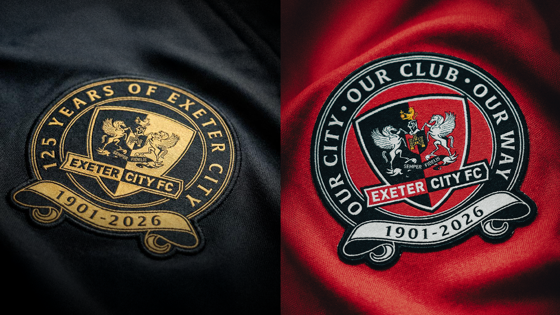
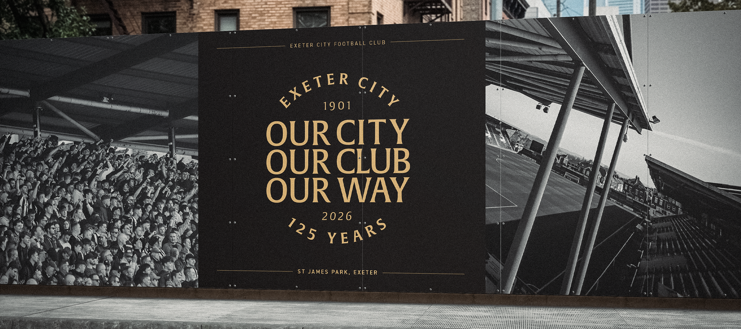
Over a two-month development process, undertaken in close collaboration with the club’s board, numerous directions were explored, refined and presented. The final outcome comprises a primary anniversary crest, an alternative version incorporating the club’s 2026/27 mission statement, “Our City, Our Club, Our Way”, and a suite of supporting brand marks designed to ensure consistency across all applications throughout the commemorative season.
Typography played a significant role in establishing the character of the identity. Gerard Unger’s Alverata typeface was selected for its roots in Romanesque inscriptional lettering, a typographic tradition associated with permanence, craftsmanship and commemoration. Derived from letterforms historically carved into stone across medieval Europe, the typeface possesses a timeless architectural quality that felt particularly appropriate for an anniversary project of this nature.
Its historical references also create a meaningful connection to Exeter itself. The Romanesque influences present within Alverata echo elements of Exeter Cathedral and the city’s wider architectural heritage, establishing a subtle relationship between club, city and identity. This shared visual language of inscription and stone carving helped reinforce the commemorative nature of the project, giving the anniversary mark a sense of permanence and significance appropriate for one of the most important milestones in the club’s history.
-
ABOUT THE CLIENT
Exeter City F.C. is a professional football club based in Exeter, Devon, competing in the English Football League.
Nicknamed “The Grecians”, Exeter City plays its home matches at St James Park and is widely recognised for its supporter-owned model, with fans holding a majority stake through the Exeter City Supporters’ Trust. Established in 2003 following the club’s financial collapse, the Trust has played a central role in shaping Exeter City’s modern identity, championing transparency, long-term sustainability and a strong connection between the club and its community. Widely regarded as one of English football’s leading examples of supporter ownership, this model continues to underpin the club’s values both on and off the pitch.
-
DISCIPLINES
→ Branding & Identity
→ Apparel Design
→ Motion Design