
CREWE ALEXANDRA: RECONNECTING WITH ITS ROOTS
-
ABOUT THE PROJECT
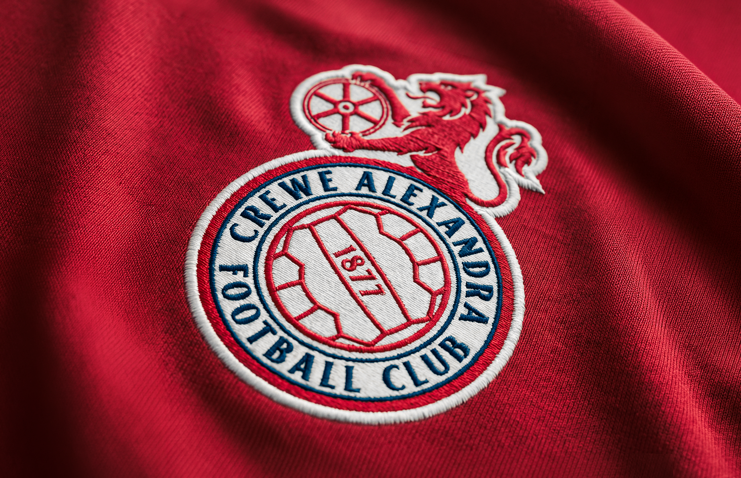
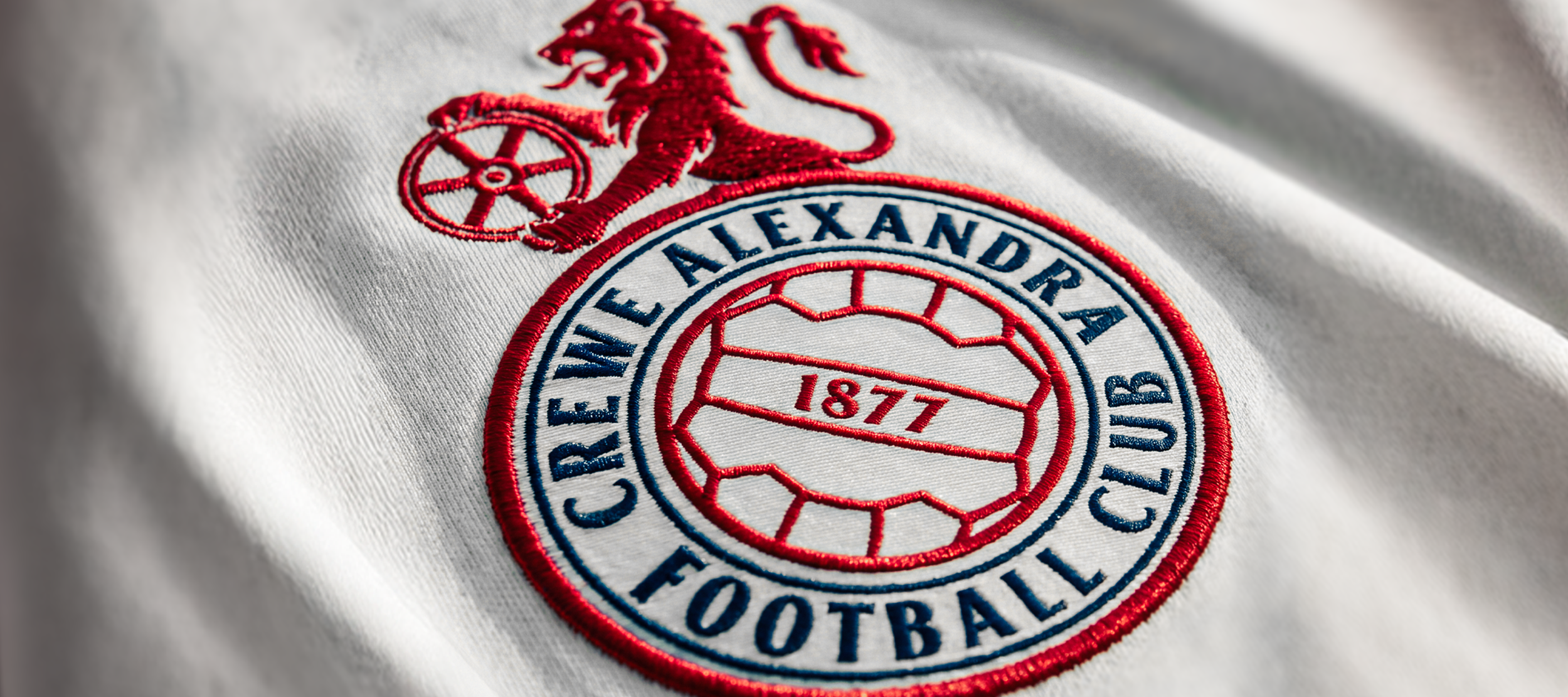
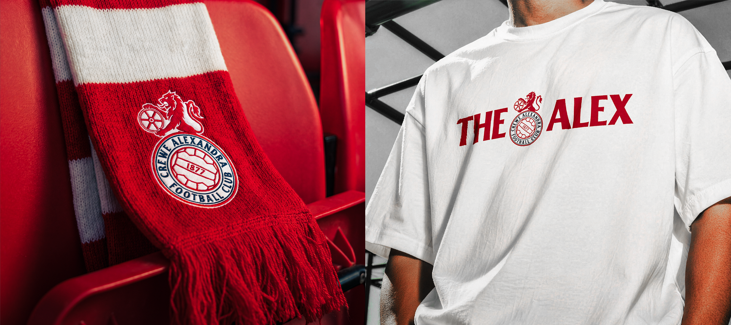
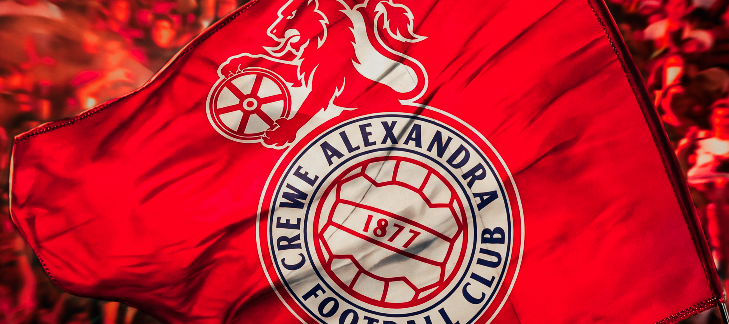
A proposed reimagining of Crewe Alexandra’s visual identity, informed by the club’s heritage and heavily inspired by the 1975-1990 crest.
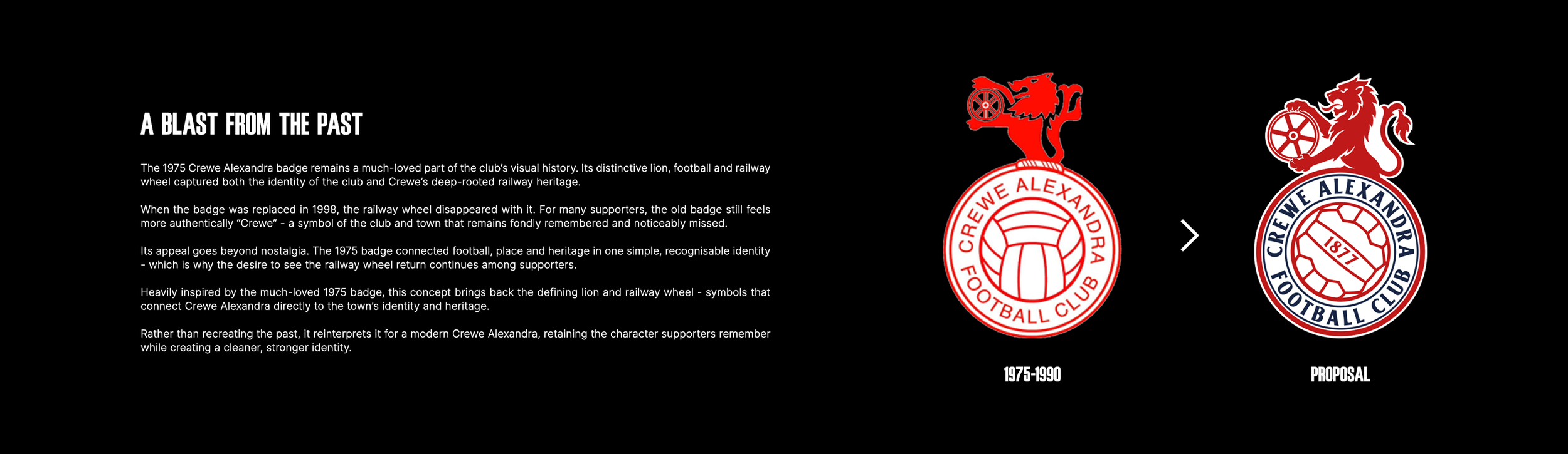
The 1975 badge marked a defining point in Crewe Alexandra’s visual history, introducing the now-iconic combination of the lion holding a railway wheel above a roundel crest. The wheel itself was a direct reference to Crewe’s identity as a railway town, with the club’s “Railwaymen” nickname similarly reflecting the railway works that shaped the town and the club.
That connection became the central focus of this redesign.
The railway wheel was removed from the club’s identity in the late 1990s, and its absence has continued to be a point of discussion among supporters. The call to “Bring Back The Wheel” has resurfaced repeatedly over the years, with supporters continuing to advocate for the return of the historic motif.
This concept puts it back at the heart of the crest.
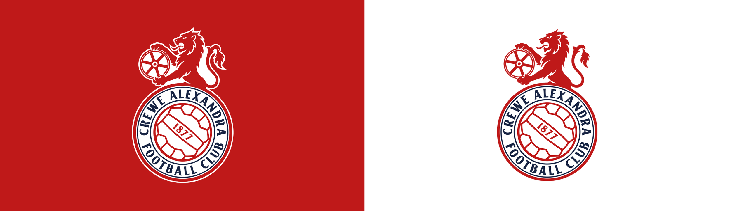
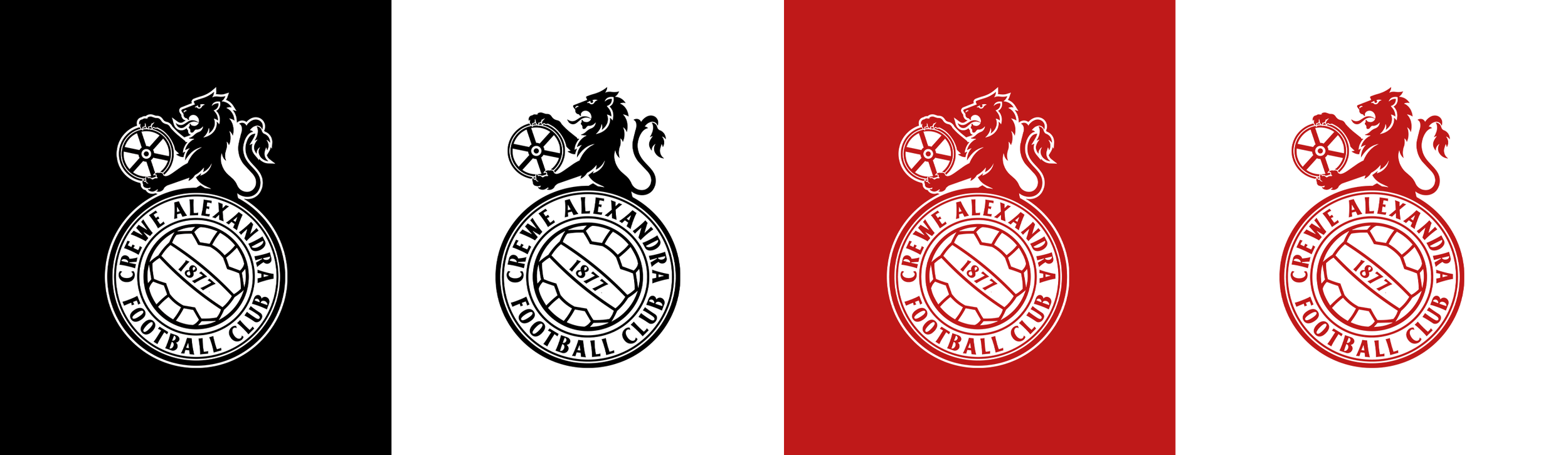
The lion-and-wheel composition from the 1975 identity forms the foundation, while the artwork has been completely redrawn and refined. The circular construction, football and typography retain the character of the original, but are rebalanced through cleaner geometry, stronger proportions and a more considered visual hierarchy.
Importantly, the intention was not to simply recreate a historic crest.
It was to identify the visual elements that carry genuine meaning for Crewe Alex and evolve them into a cohesive identity for the modern game.
The outcome is a badge that looks forward without disconnecting from where the club came from - bringing one of Crewe’s most distinctive symbols back into focus. -
This concept puts it back at the heart of the crest.
The lion-and-wheel composition from the 1975 identity forms the foundation, while the artwork has been completely redrawn and refined. The circular construction, football and typography retain the character of the original, but are rebalanced through cleaner geometry, stronger proportions and a more considered visual hierarchy.
Importantly, the intention was not to simply recreate a historic crest.
It was to identify the visual elements that carry genuine meaning for Crewe Alex and evolve them into a cohesive identity for the modern game.
The outcome is a badge that looks forward without disconnecting from where the club came from - bringing one of Crewe’s most distinctive symbols back into focus. -
ABOUT CREWE ALEXANDRA
Crewe Alexandra Football Club, nicknamed The Railwaymen, is a professional football club based in Crewe, Cheshire. Founded in 1877, the club has a proud history rooted in the town’s railway heritage and currently competes in the English Football League.
Known for its distinctive identity, strong community connection and renowned youth academy, Crewe Alexandra has played an important role in developing young footballing talent, producing numerous players who have gone on to enjoy successful careers at the highest levels of the game.
The club plays its home fixtures at the Mornflake Stadium, with the famous Gresty Road ground having been its home for more than a century.
-
DISCIPLINES
→ Branding & Identity

ONGOING