WEST HAM UNITED, REIMAGINED
-
THE PROJECT
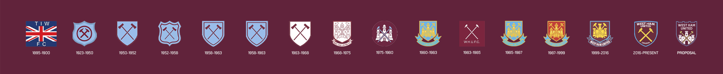
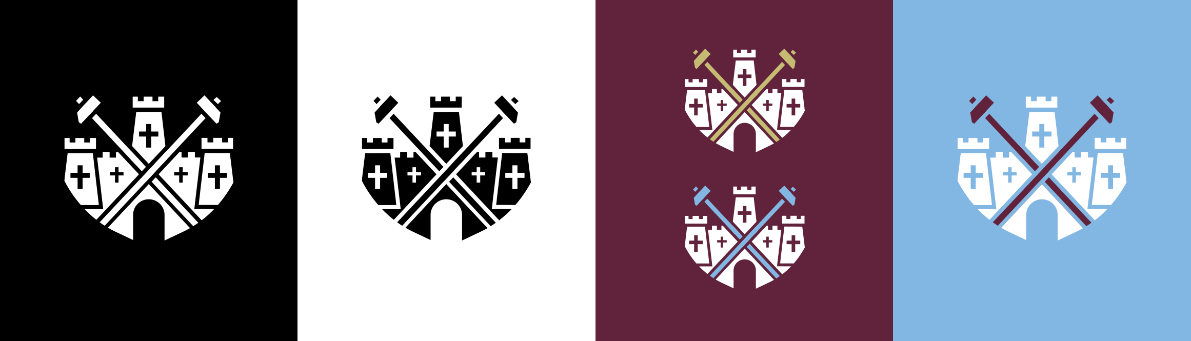
This project started from a clear observation: modern football crests are losing their soul. Across the game, clubs have flattened, simplified, and sanitised their identities in the name of “digital-first” thinking - and supporters have noticed. Fans consistently react against these changes, describing new crests as generic, corporate, and emotionally empty.
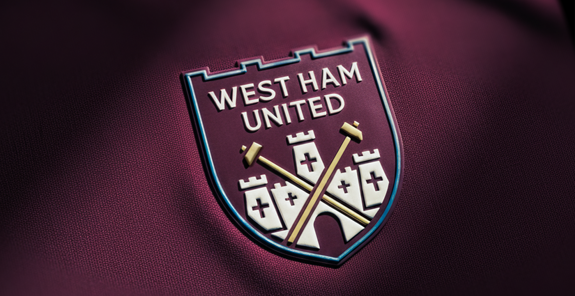
West Ham’s 2016 rebrand reflects that wider trend. While technically clean and functional, over simplification has stripped away much of the character and nostalgia that supporters emotionally connect with. What’s left works on an app icon, but struggles to carry the weight of history and community.
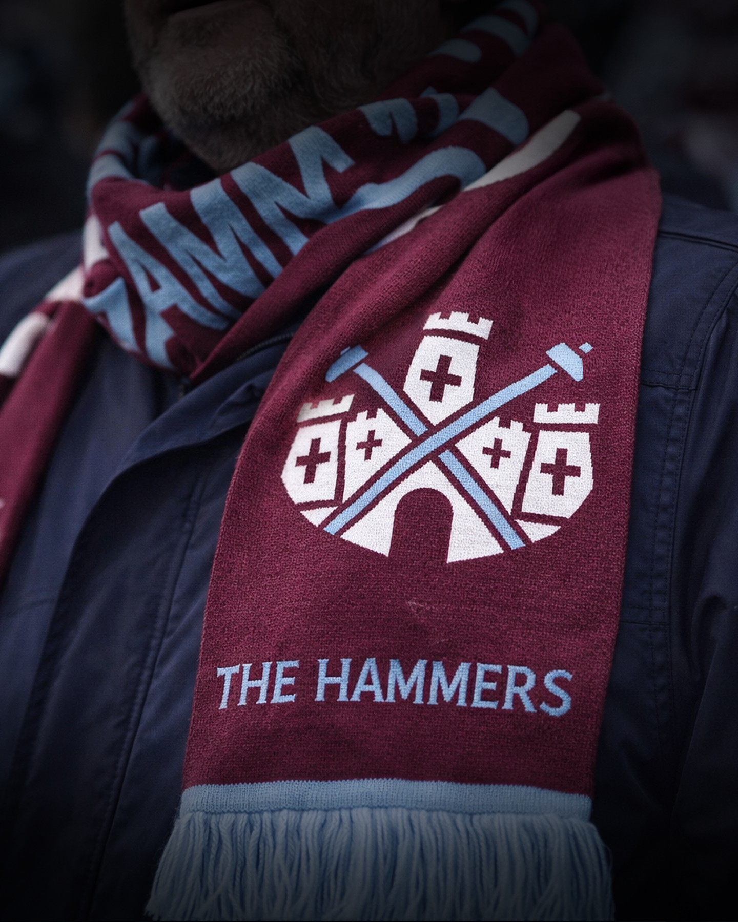
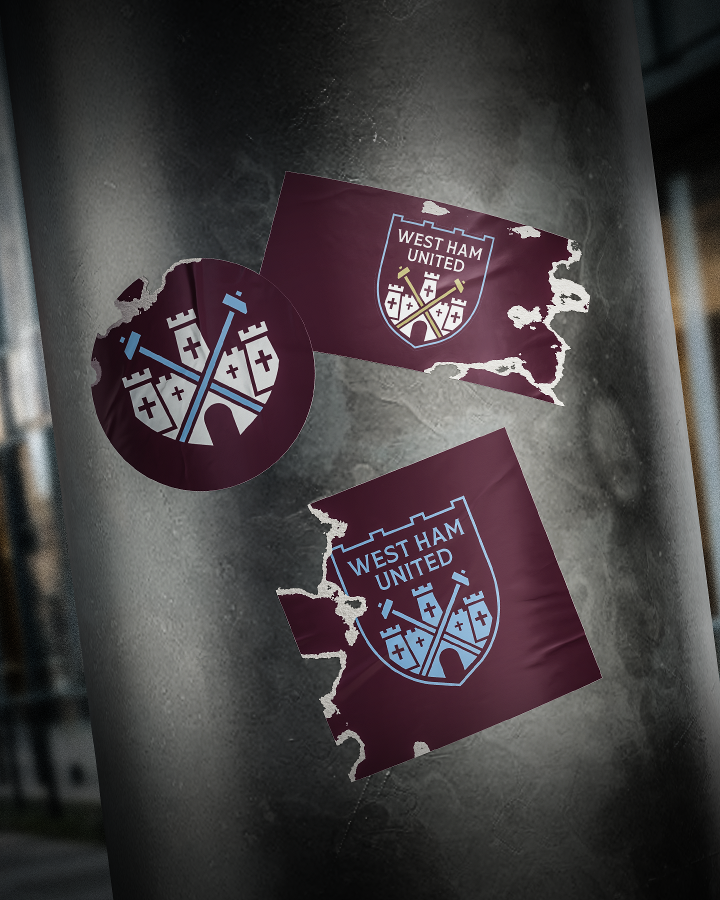
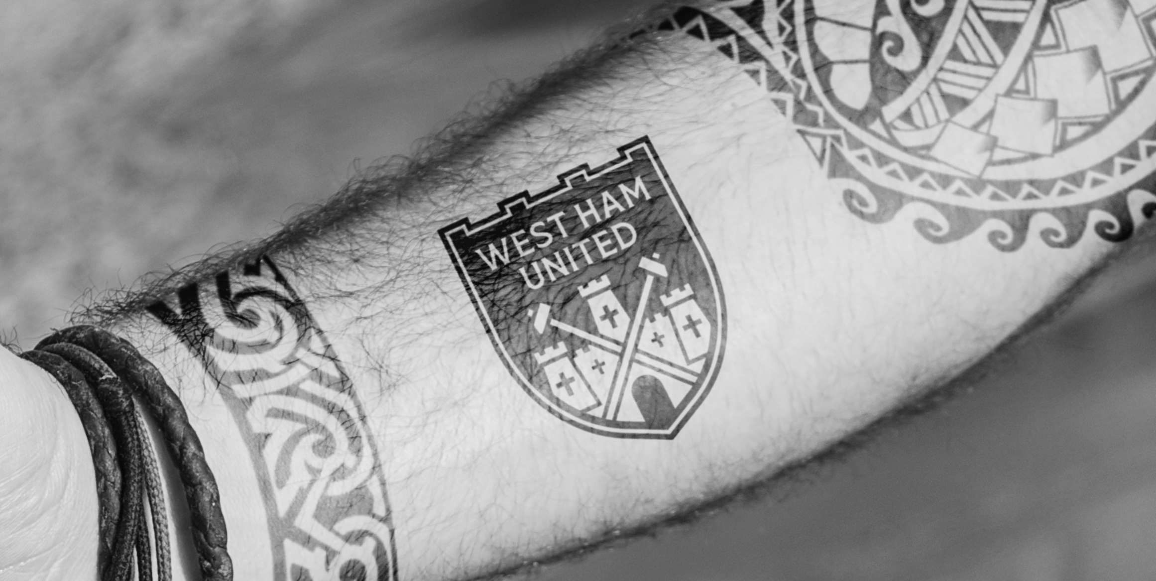
This concept pushes back against that thinking. The focus was on building on what Hammers fans knew and loved for years and years, preserving symbolism and restoring balance.
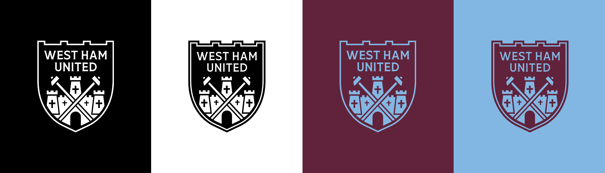
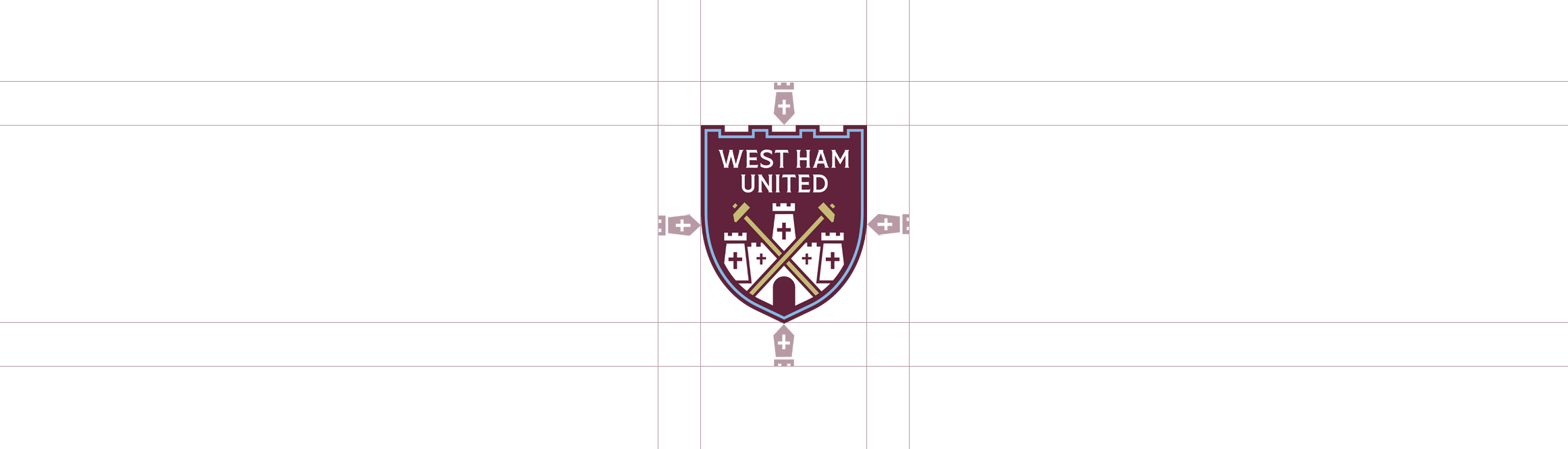
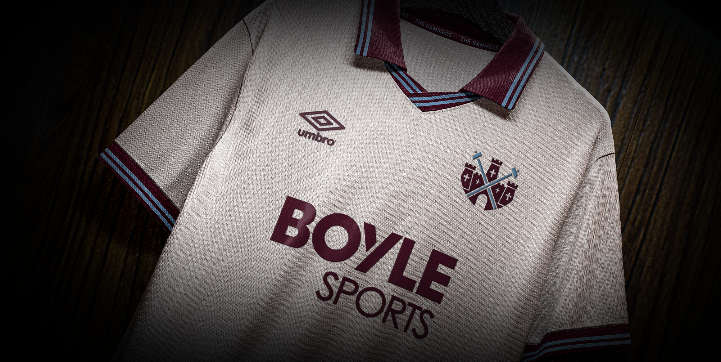
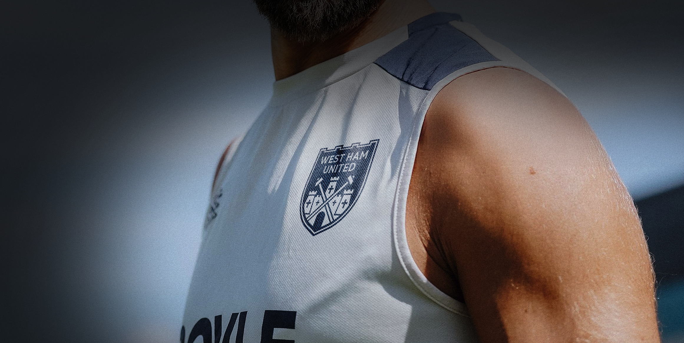
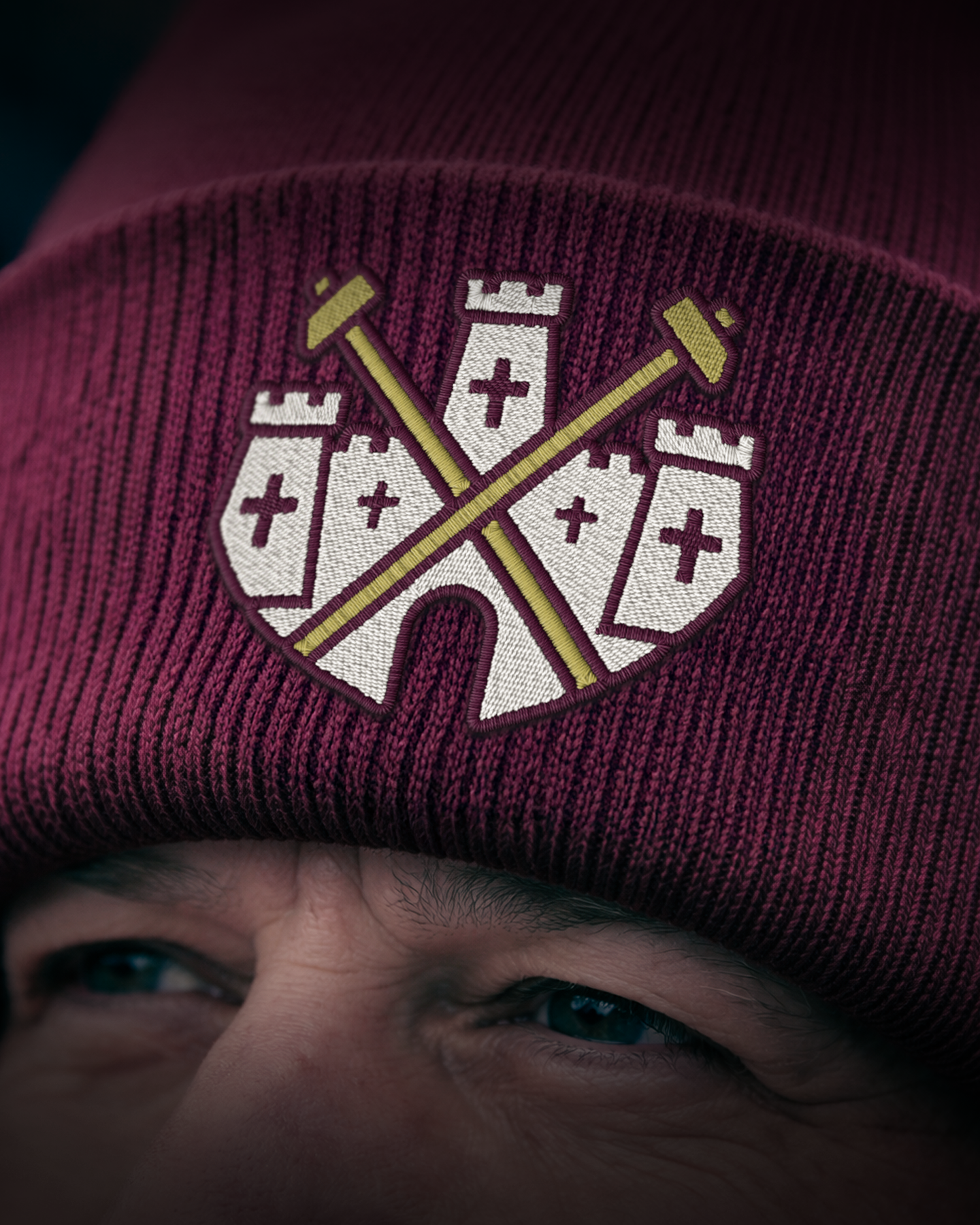
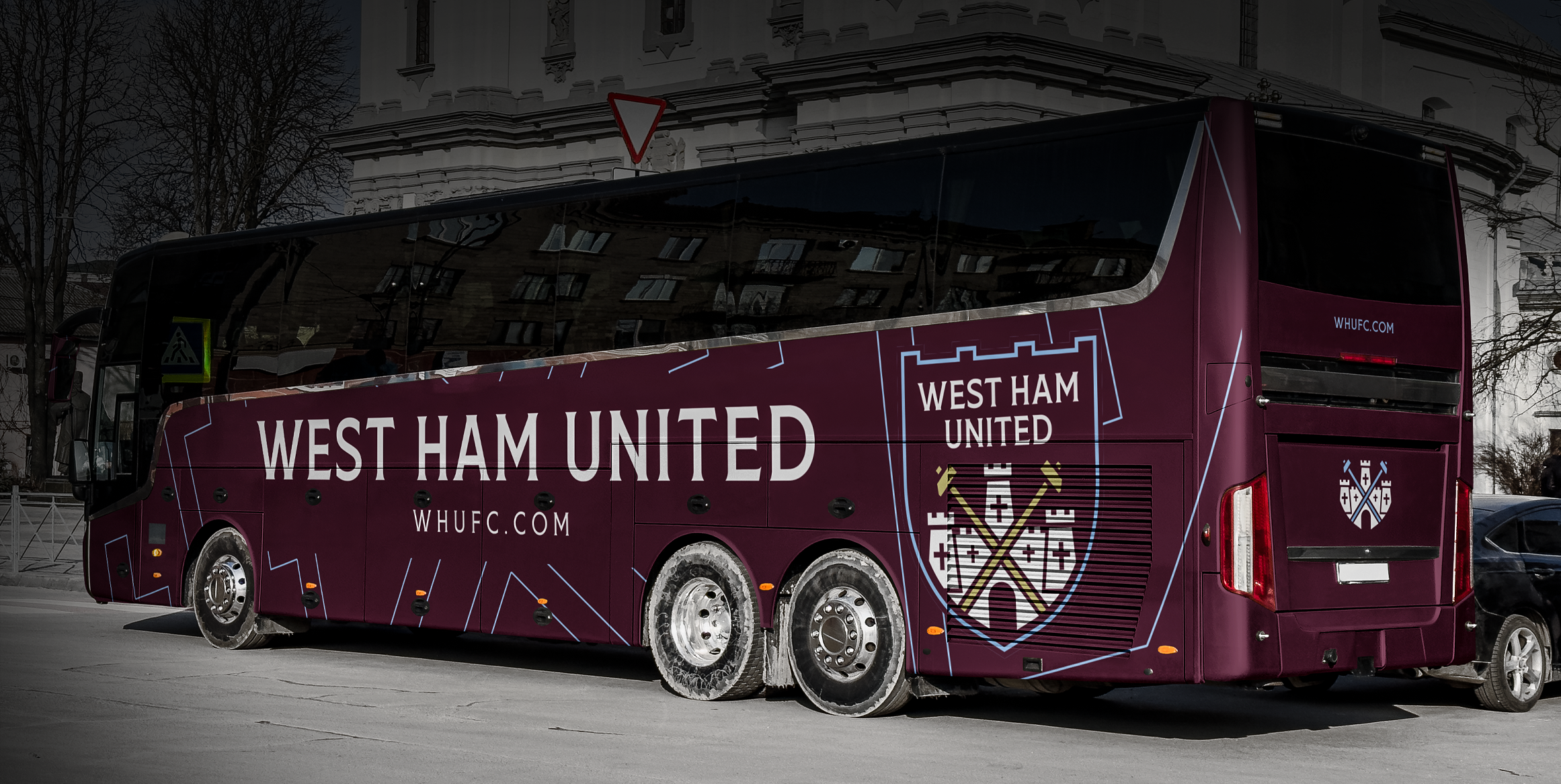
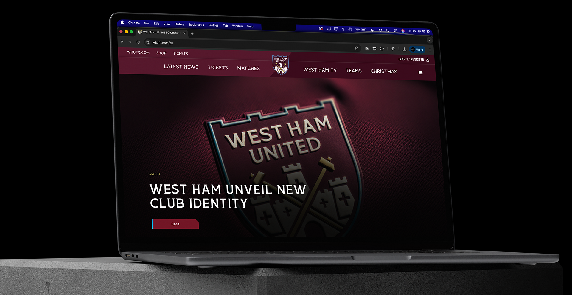
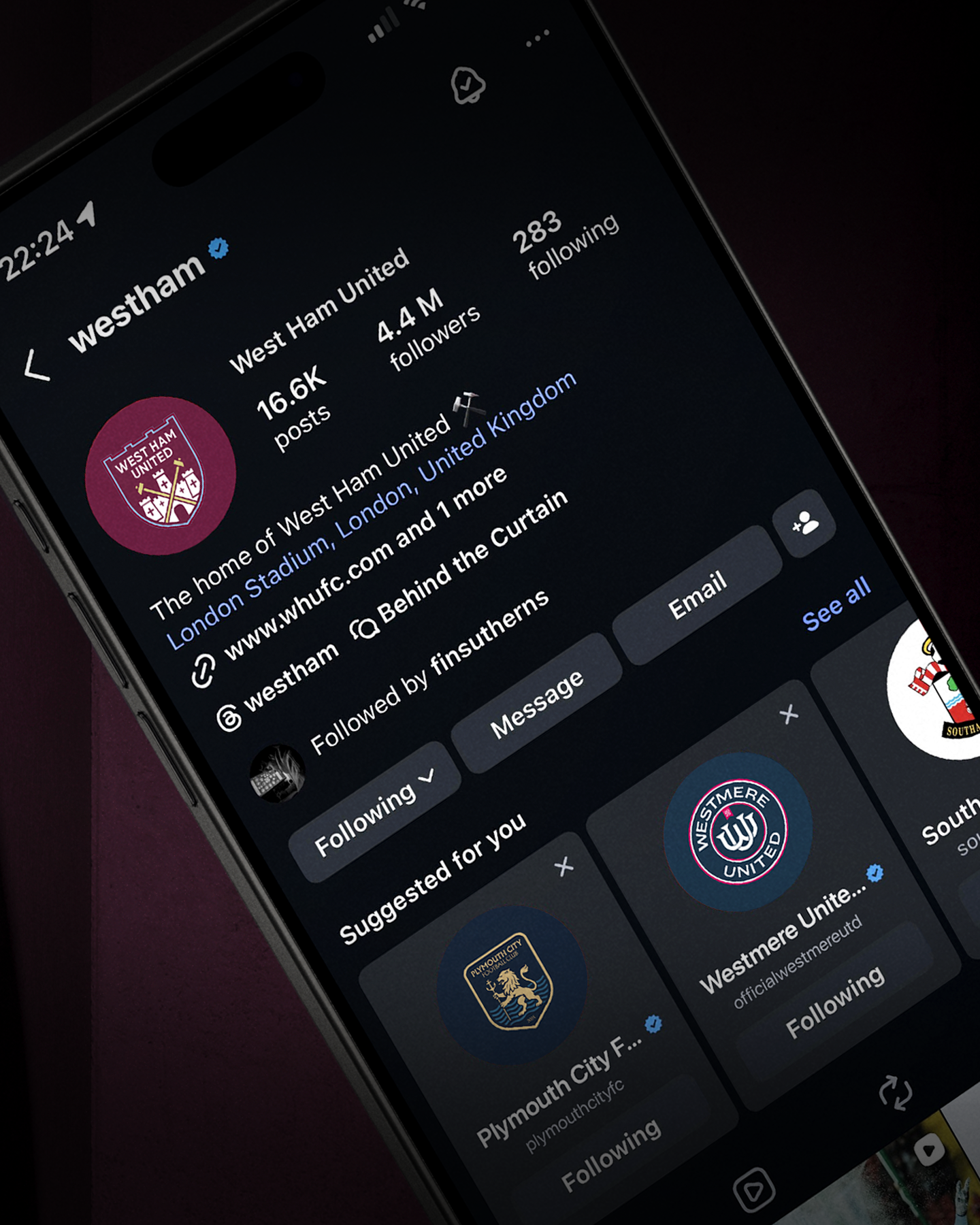
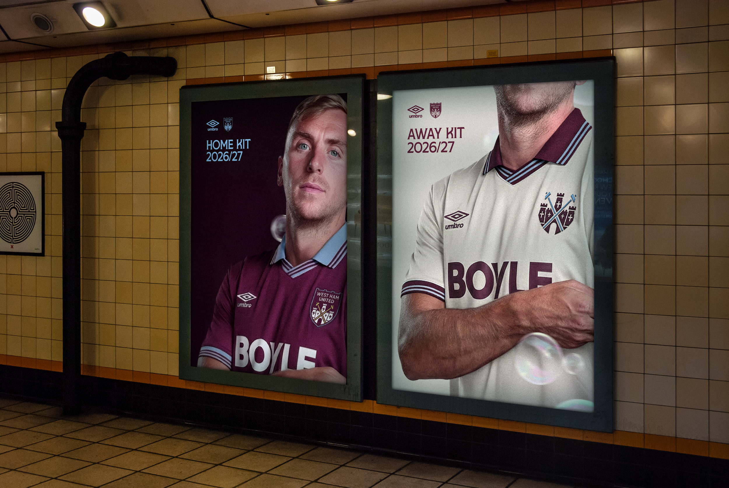
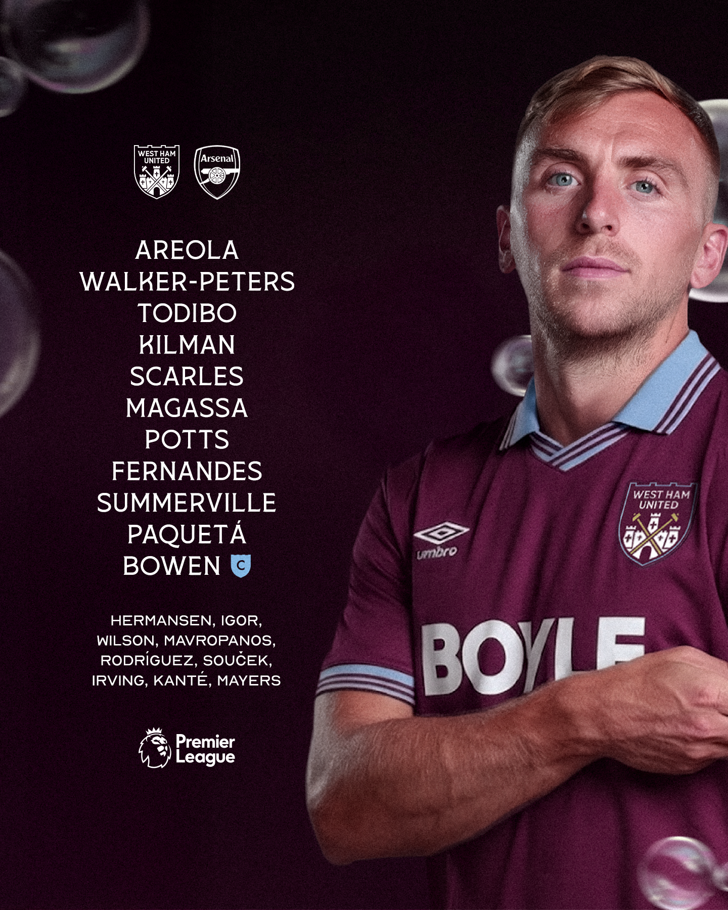
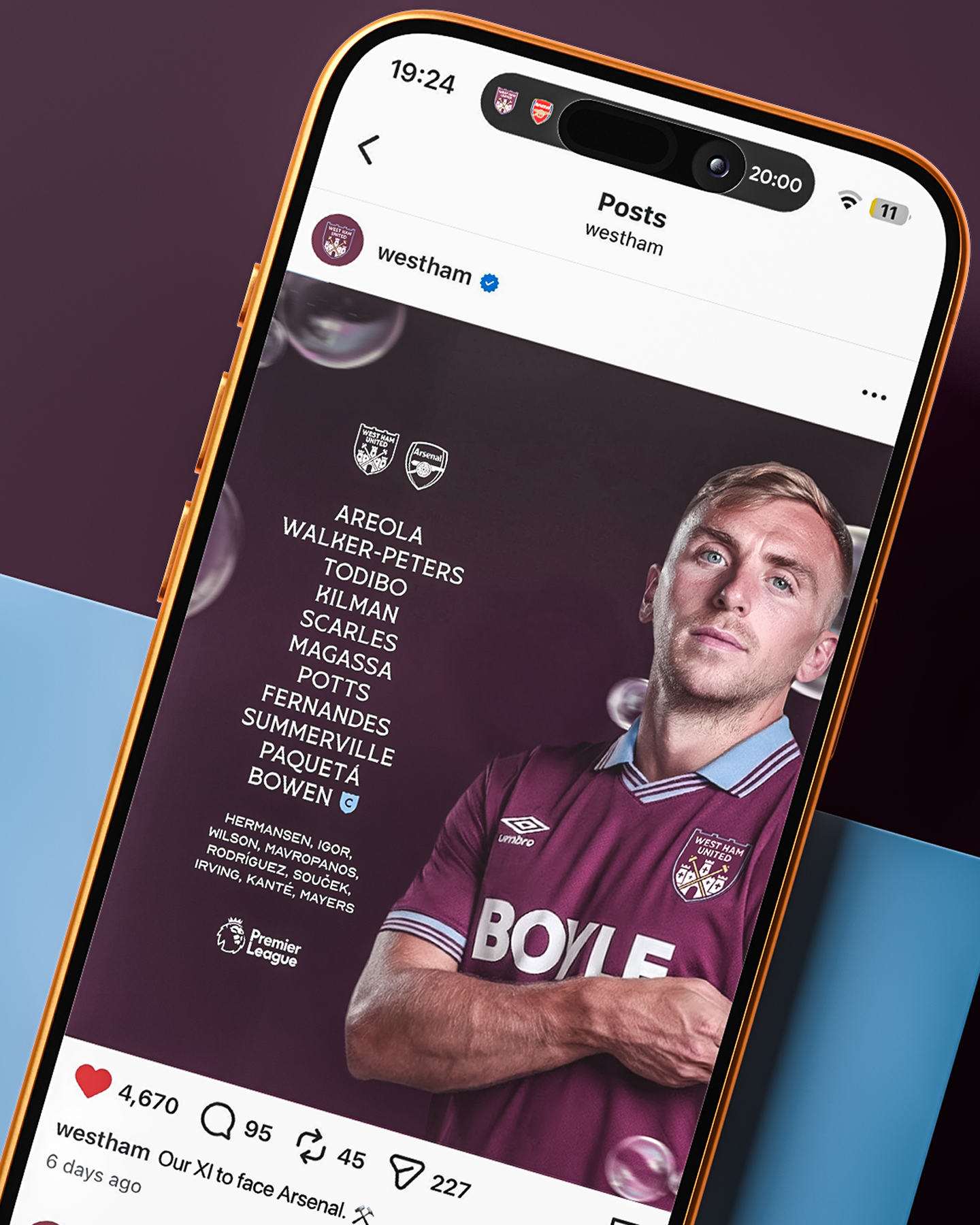
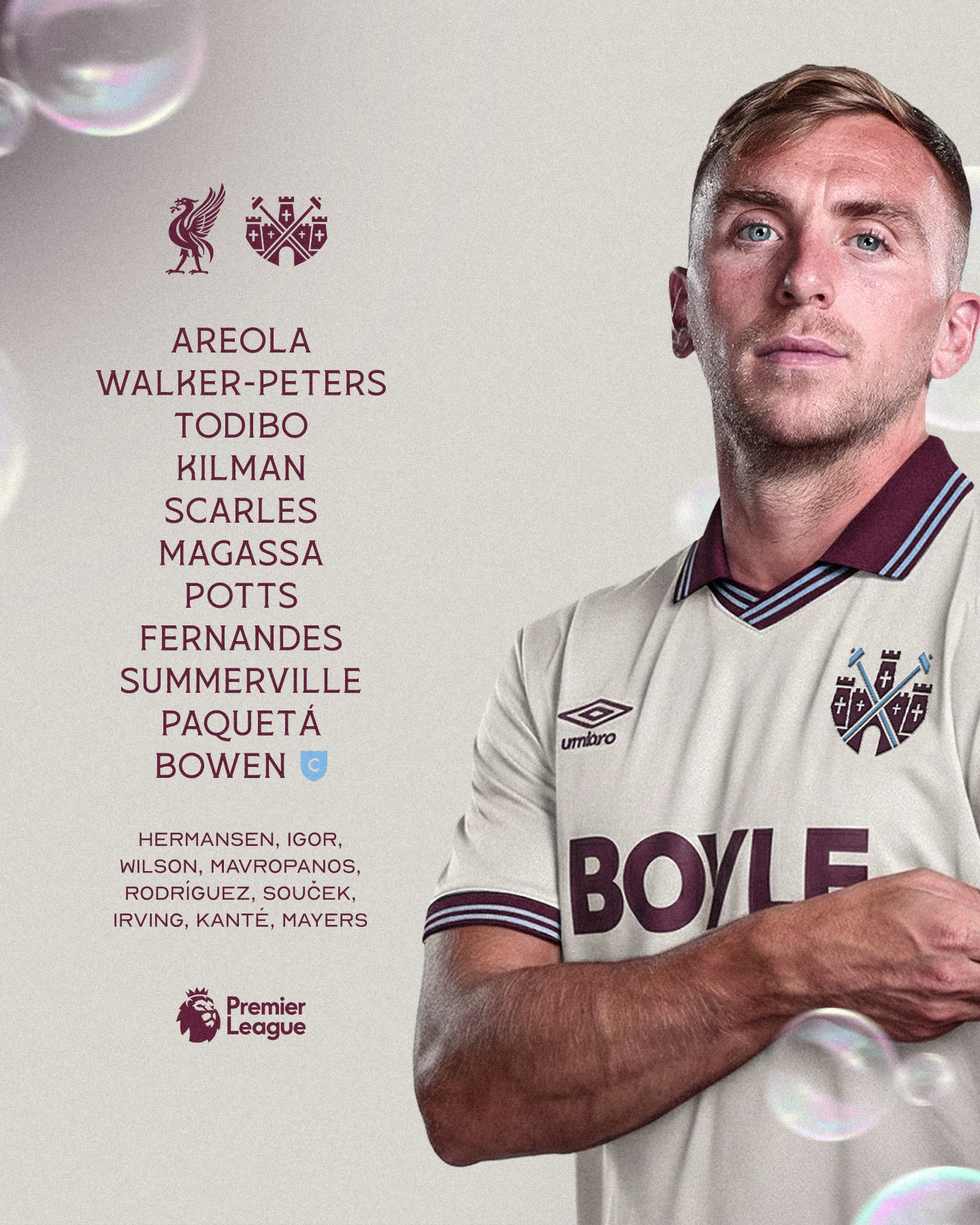
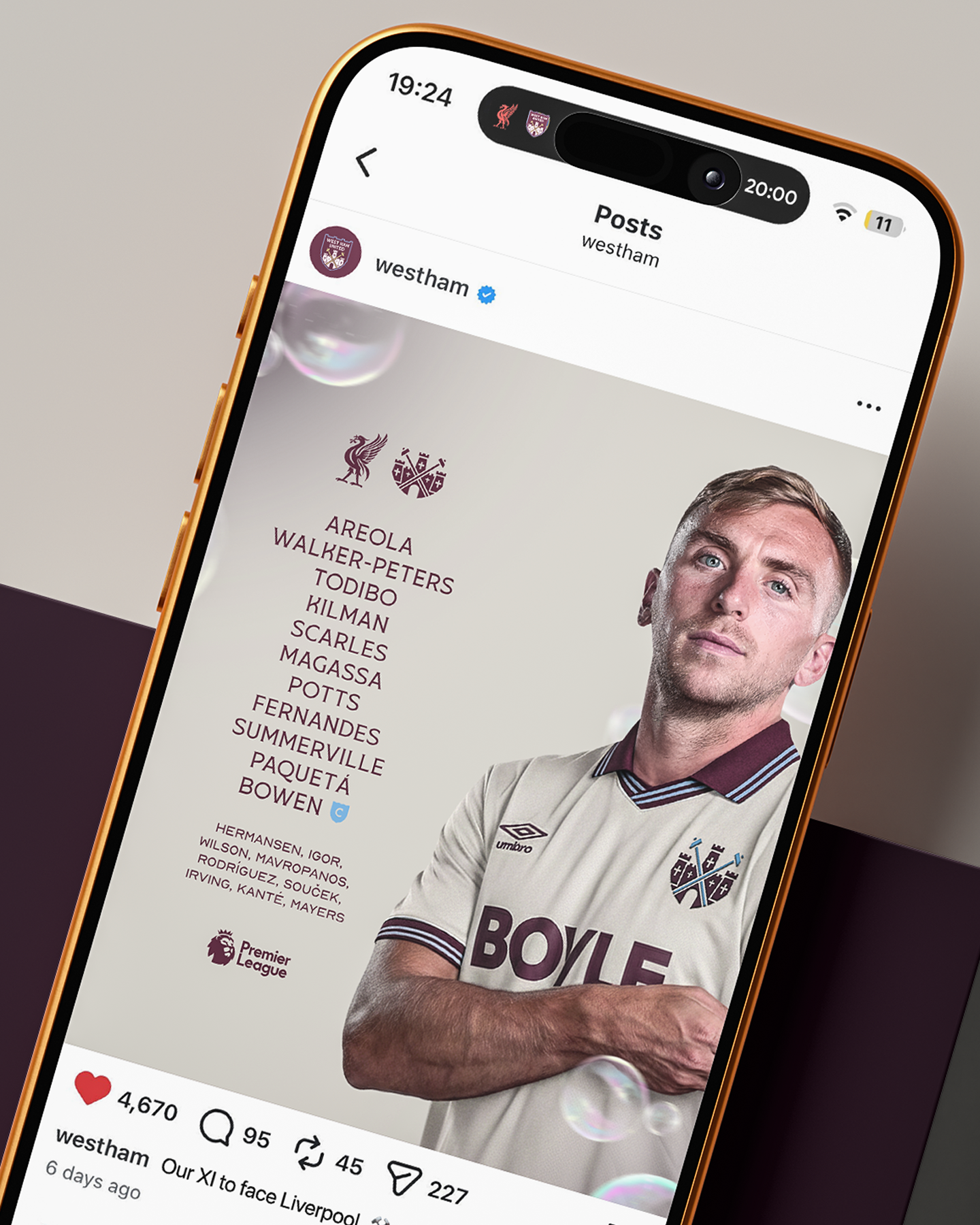
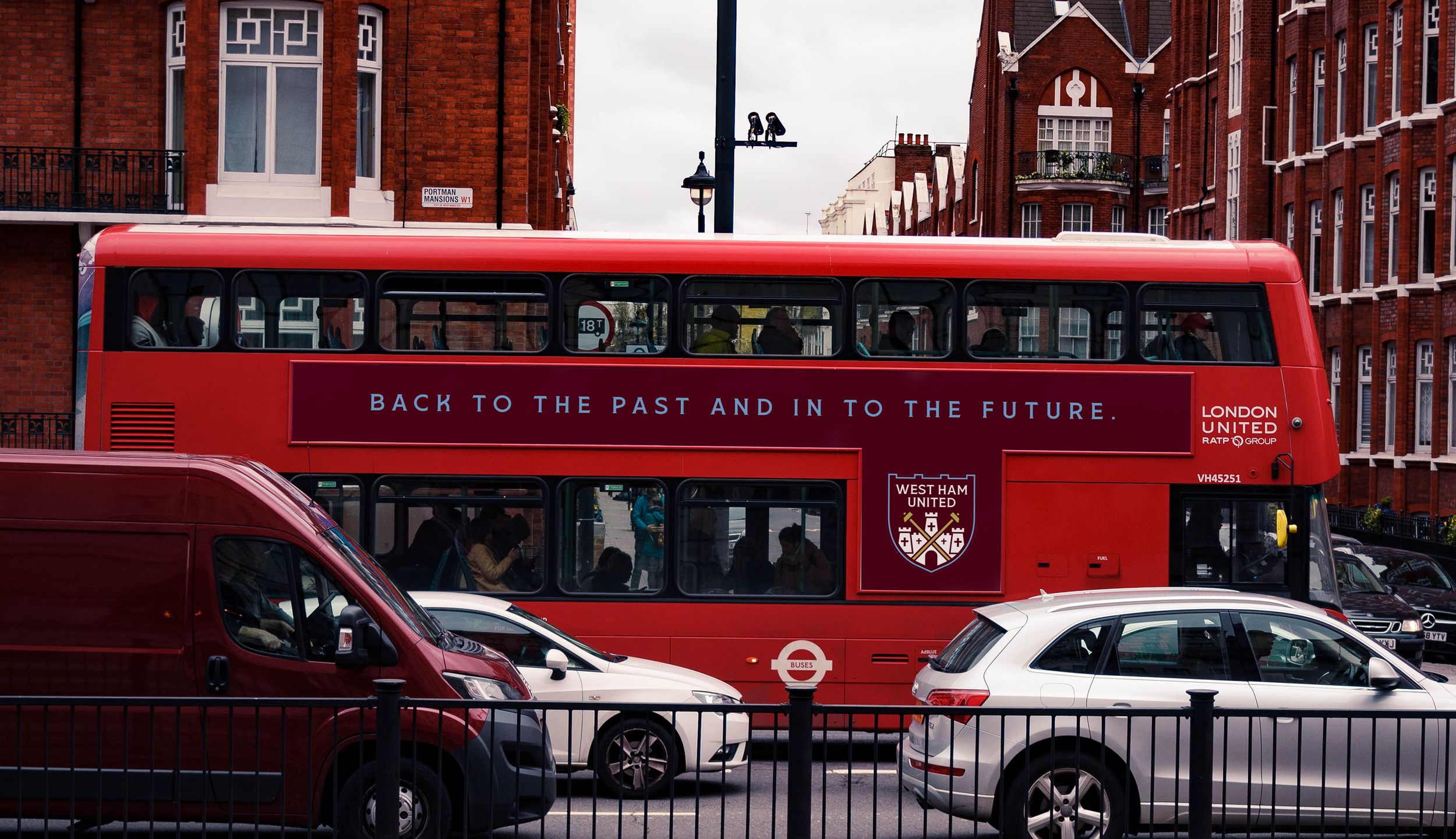
The wider system shows how an identity like this can still function confidently in modern contexts - kits, transport, social, and more, without sacrificing personality. Digital compatibility doesn’t have to mean visual emptiness, and simplicity doesn’t need to come at the cost of meaning.
The crests caused quite the stir online, loved by thousands of West Ham supporters and was dubbed “the best thing fans have seen all year” in an article written by Hammers News. -
DISCIPLINES
→ Branding & Identity
→ Sportswear Design
→ Digital Design