FIN SUTHERNS DESIGN REBRANDING
-
THE PROJECT
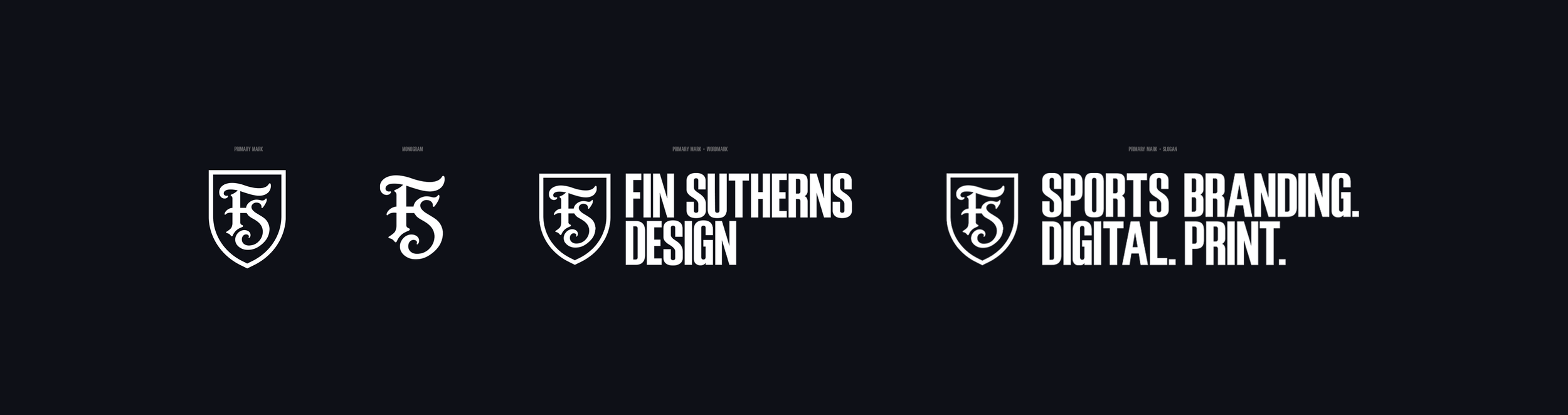
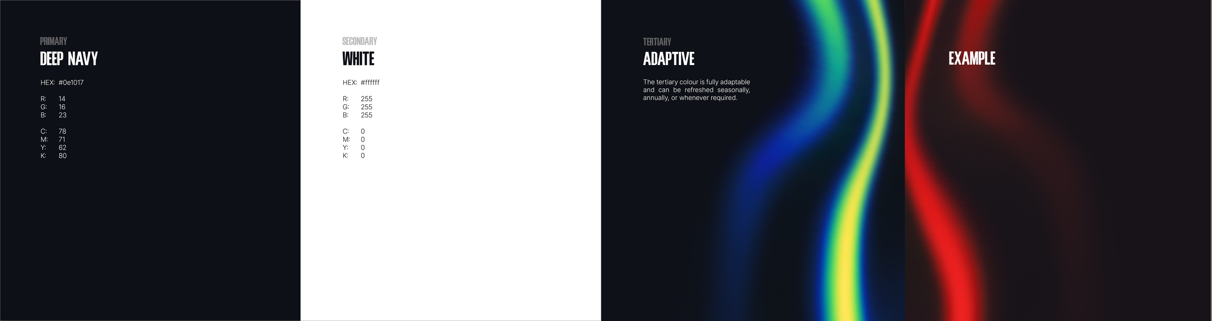
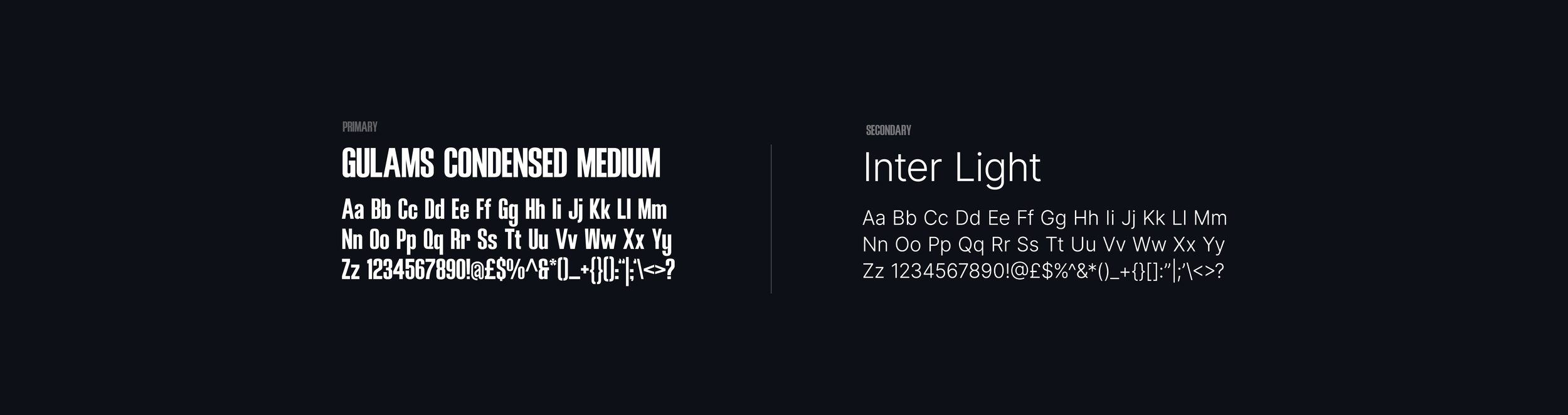
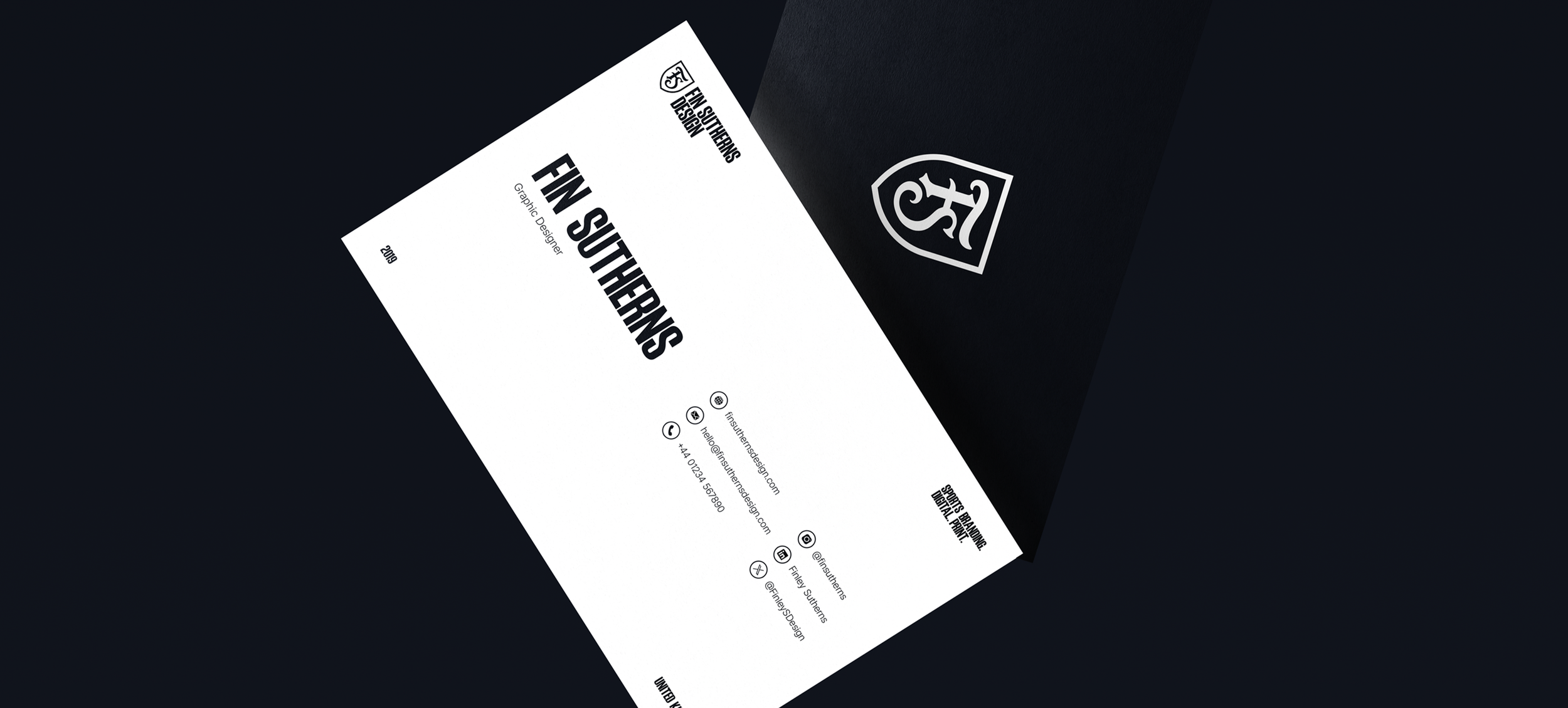
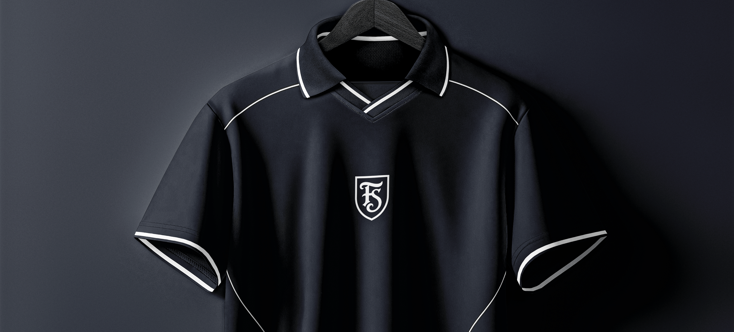
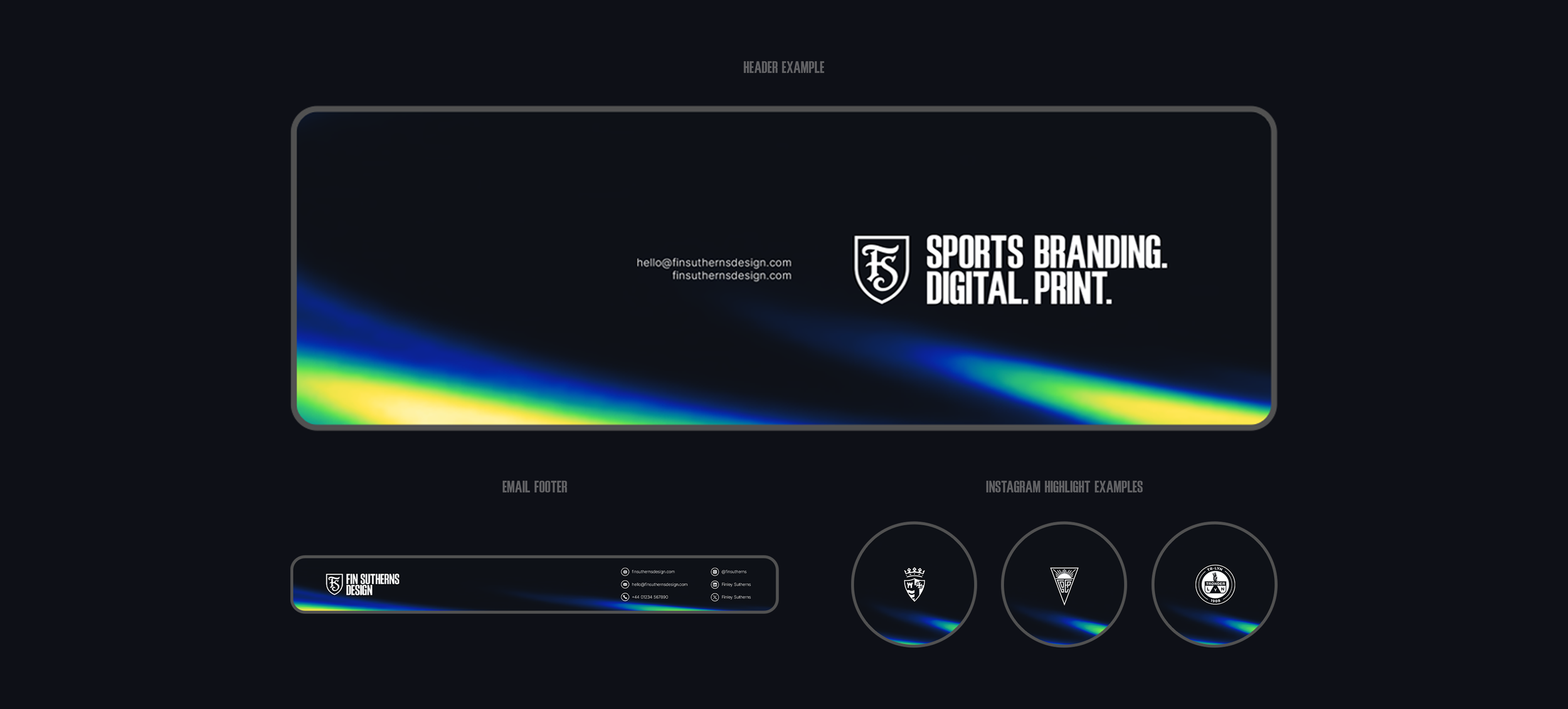
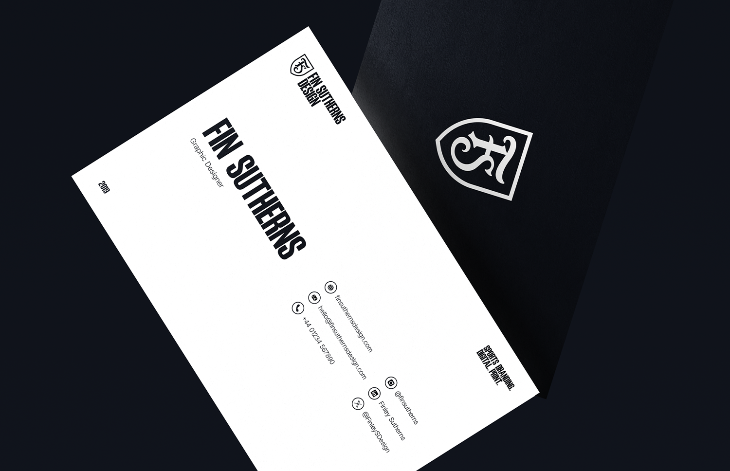
It was about time I took a proper look at my own branding, rather than just swapping the colour palette every so often. I’d been using the same two-weight typeface logo for far too long, so I decided to create a proper mark, a simple, elegant monogram set within a shield, a subtle nod to my main area of expertise.
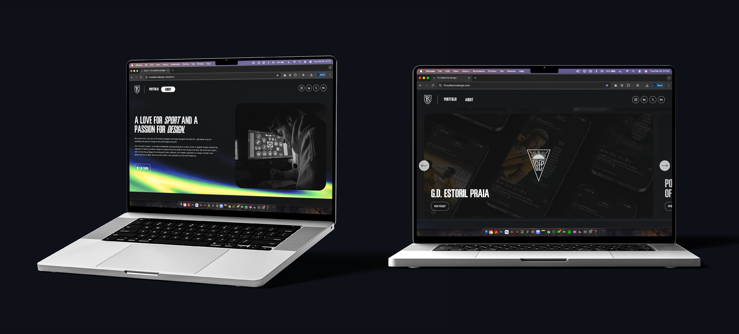
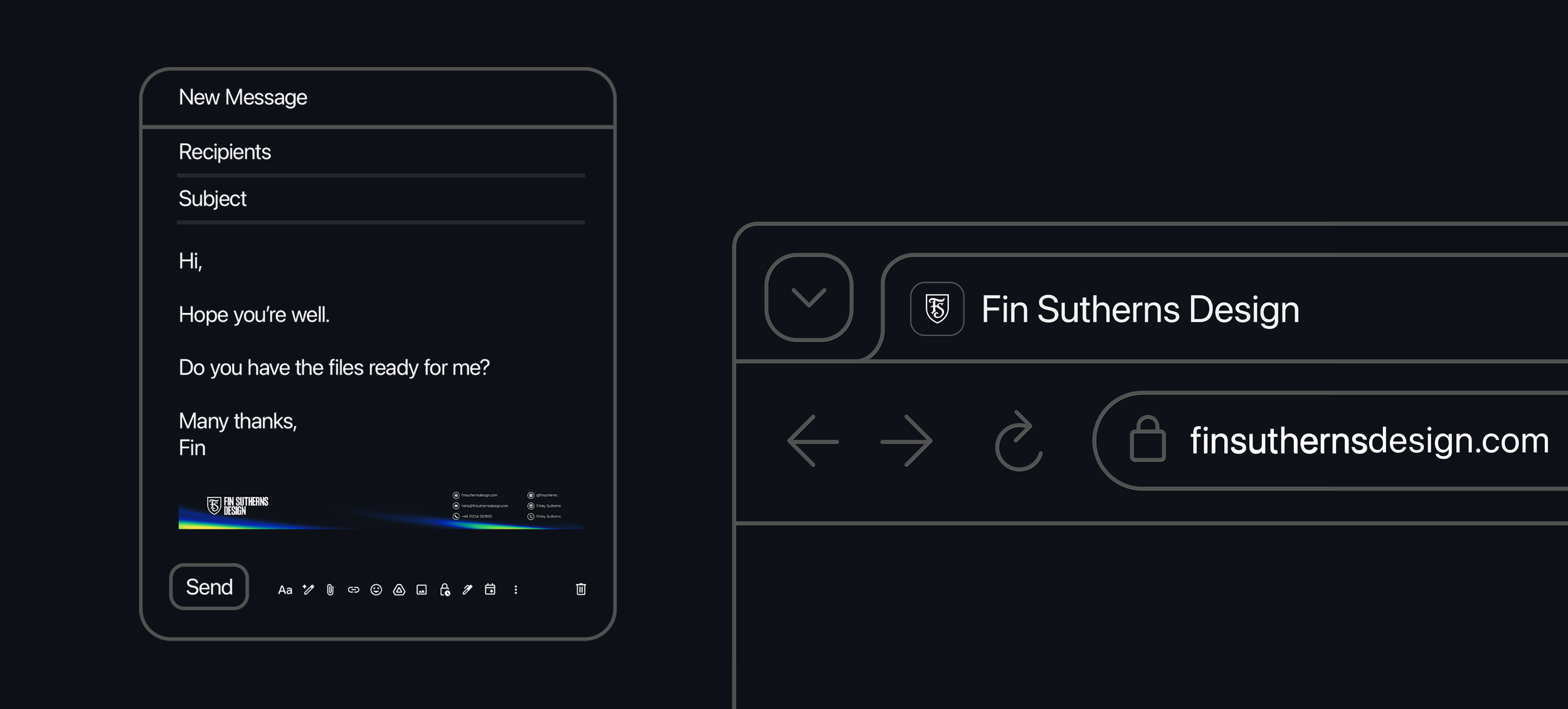
Along with that came some tweaks to my website and a whole lot of custom code (fun), and I’m finally happy with how my business is represented online.
-
DISCIPLINES
→ Branding & Identity
→ Sportswear Design
→ Digital Design