A NEW ERA FOR
FIN SUTHERNS DESIGN
establishing fin sutherns design's first proper VISUAL identity-
N/A
CLIENT
-
BRAND IDENTITY
DISCIPLINE
-
2026
YEAR
-
TWO WEEKS
DURATION
-
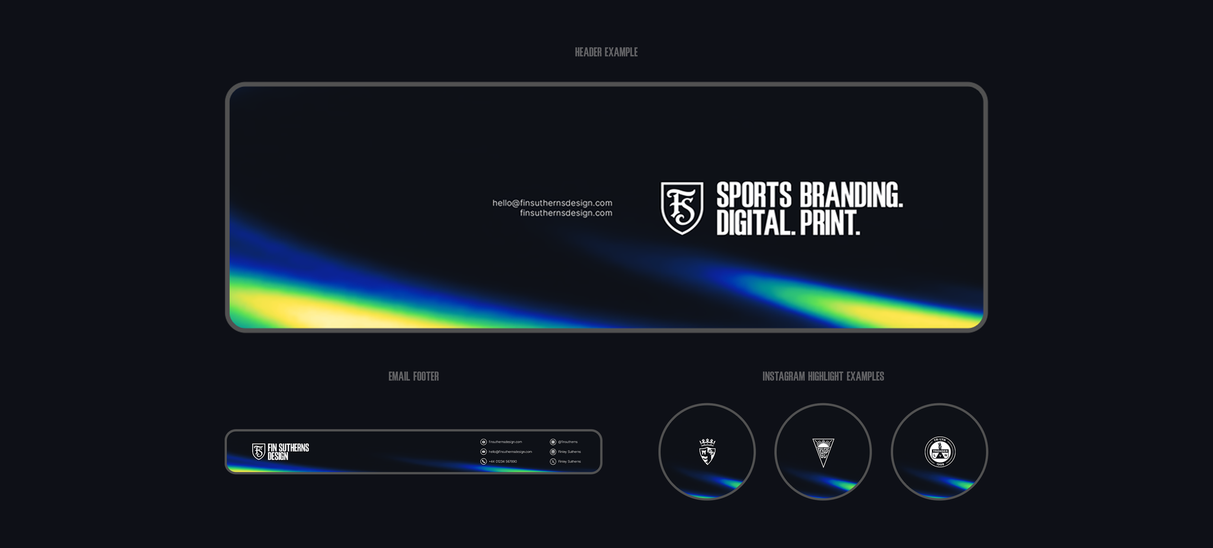
It felt like the right time to take a proper look at my own branding and give it the same level of attention I put into my client work, rather than simply changing the colour palette every few months. I’d been using the same two-weight typographic logo for far too long, and it no longer felt like a true reflection of the work I wanted to put out into the world.
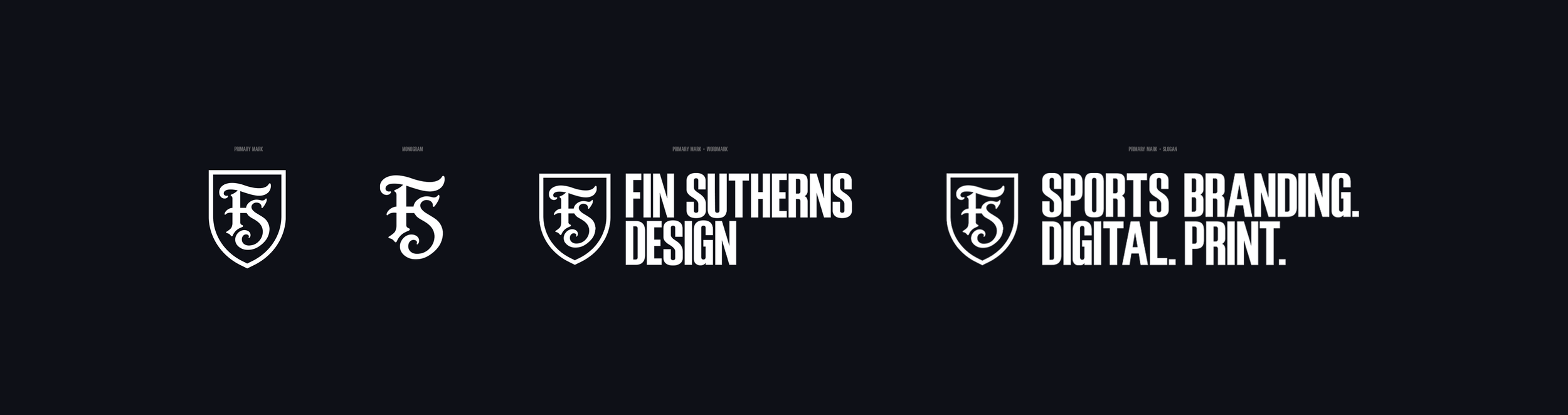
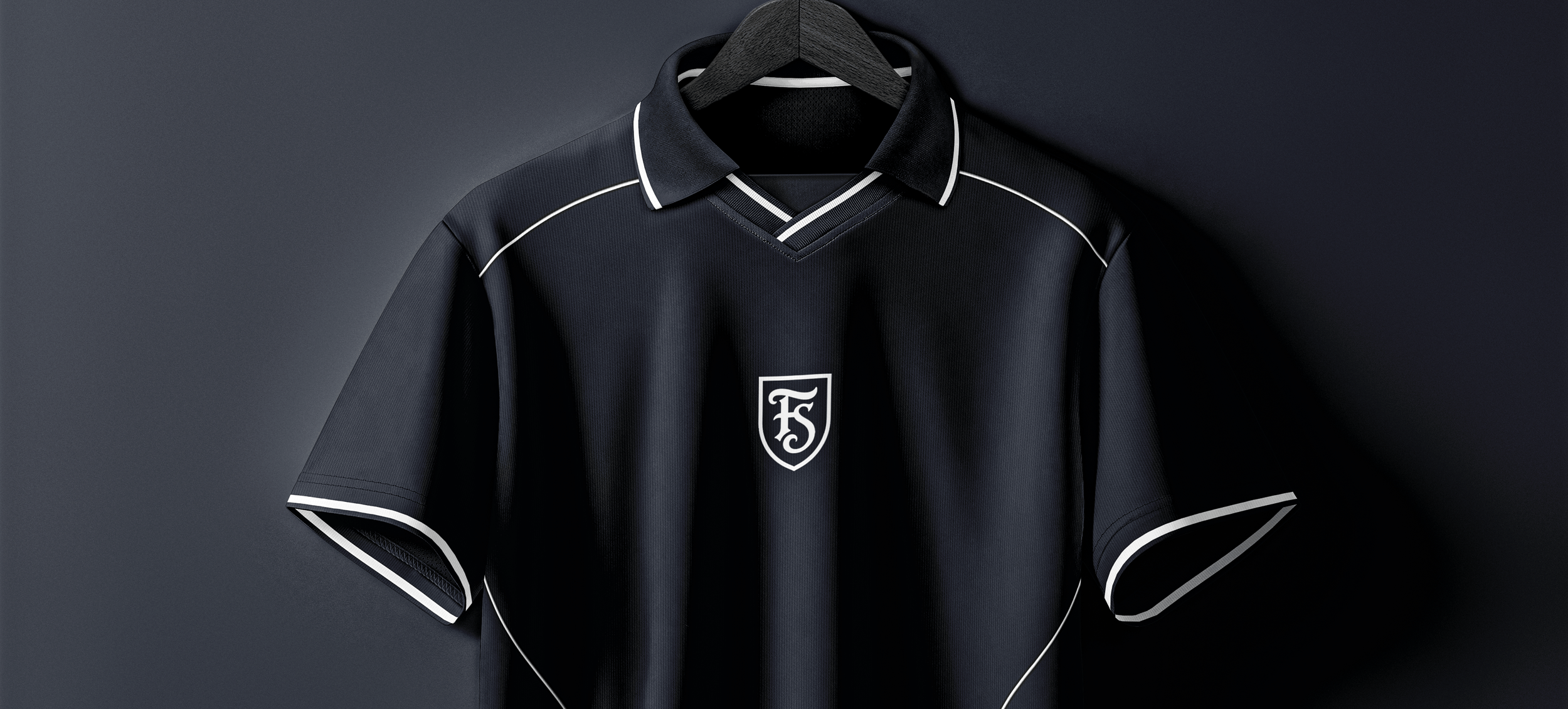
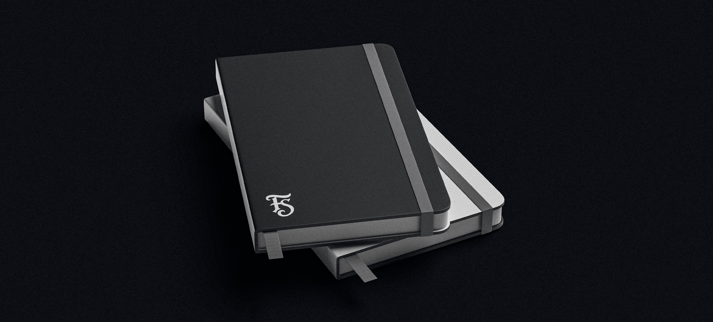
The aim was to create something more considered, distinctive and enduring. I developed a simple, elegant monogram housed within a shield, creating a recognisable mark that subtly references my specialism in sports branding and football crest design, without being too literal. The result is an identity that feels more refined and purposeful, while still retaining a sense of personality.
-
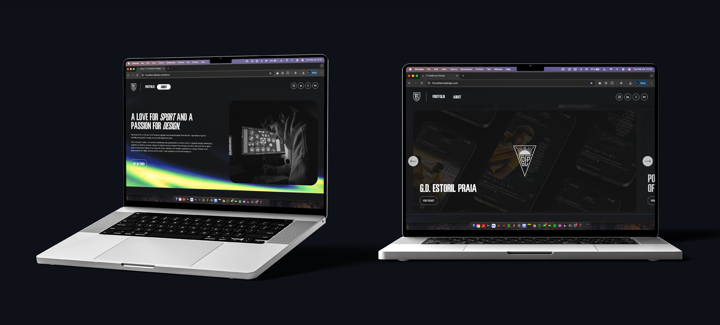
Naturally, a new identity called for a few changes elsewhere, too. Alongside refining the visual direction of my website, I spent a fair amount of time working through it to get the finer details just right. From the overall presentation to the smaller interactions, I wanted everything to feel cohesive and intentional.
-
It’s been a worthwhile exercise in applying my own design philosophy to my own business. After spending so much time developing identities for others, it feels good to have one that properly represents me, my work and the direction I was taking Fin Sutherns Design.